Table of Contents
ToggleIn a world that often feels like a whirlwind of chaos, finding peace can be as simple as choosing the right color. Calming color schemes have the power to transform any space into a serene sanctuary, making it easier to unwind after a long day or focus on that project you’ve been procrastinating on. Who knew that a splash of soft blue or a hint of gentle green could work wonders for the mind?
Imagine walking into a room painted in soothing pastels, where stress melts away like ice cream on a hot day. It’s not just about aesthetics; it’s about creating an environment that nurtures tranquility and boosts productivity. So, if you’re ready to turn your home or office into a calming oasis, let’s dive into the world of color and discover how to paint your way to peace.
Understanding Calming Color Schemes
Calming color schemes create peaceful environments that promote relaxation. These color combinations significantly influence mood and can improve focus while reducing stress.
Definition of Calming Color Schemes
Calming color schemes consist of hues that evoke tranquility and comfort. Soft pastels and muted tones characteristic of these schemes include light blue, pale green, and gentle lavender. Such colors are often associated with nature, fostering a sense of balance and well-being. Color theory highlights that these shades facilitate harmony, making spaces feel inviting and serene.
Psychological Effects of Colors
Colors impact emotions and perceptions, shaping one’s psychological state. For instance, blue tones commonly instill feelings of calmness and peace, while green connects with nature, enhancing relaxation. Warm shades like soft yellow can promote energy without overwhelming stimuli. Research shows that exposure to calming colors reduces anxiety and improves concentration. Choosing the right color palette, therefore, plays a crucial role in mental well-being and productivity.
Popular Calming Color Schemes
Calming color schemes greatly enhance spaces designed for relaxation. Understanding these combinations helps create peaceful environments.
Blue and Green Combinations
Blue and green combinations evoke feelings of tranquility. Soft blue tones paired with gentle greens mimic natural landscapes, fostering relaxation. Studies show both colors reduce stress and promote calmness. Incorporating these hues in living rooms or bedrooms can create a serene atmosphere. Consider adding these colors through paint, decor, or textiles for a refreshing look. Accents in darker shades of blue or rich greens can promote focus without overwhelming the senses.
Soft Neutrals and Pastels
Soft neutrals and pastel colors bring warmth and comfort to a space. Shades like beige, soft gray, and light lavender work well together, creating a nurturing environment. These colors serve as effective backdrops for furniture and art, enhancing overall aesthetics. Incorporating pastel shades fosters a sense of peace, making them ideal for bedrooms or meditation spaces. Light yellows and blush pinks can also add a touch of warmth while remaining calming. Experimenting with these hues in different combinations can lead to personalized, soothing spaces.
Implementing Calming Color Schemes
Using calming color schemes effectively transforms spaces into serene environments. Home decor and graphic design offer unique opportunities to apply tranquil hues.
In Home Decor
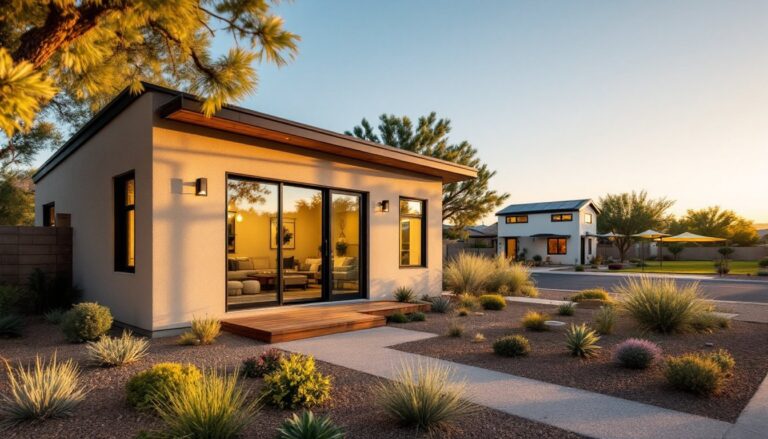
In home decor, selecting soft blue, pale green, or gentle lavender creates a peaceful atmosphere. Walls painted in these shades provide a soothing backdrop for living rooms and bedrooms. Incorporating neutral shades like beige or soft gray enhances warmth and comfort, complementing furniture and artwork effectively. Choosing textiles in calming hues—like throw pillows or blankets—adds texture while maintaining a tranquil theme. Accent pieces in muted tones promote balance and harmony throughout the space, making it feel inviting and restful.
In Graphic Design
In graphic design, calming color schemes enhance user experience and engagement. Designers often utilize soft colors to convey messages of tranquility and relaxation. Websites with light blue backgrounds attract and maintain attention while reducing stress. Fonts in gentle greens or pastel shades evoke a sense of balance, making content approachable. Employing these colors in marketing materials fosters a peaceful brand image, encouraging trust and comfort among consumers. Overall, integrating calming hues in graphic design aids in creating a positive visual narrative.
Benefits of Using Calming Color Schemes
Calming color schemes contribute significantly to overall well-being. Specific colors have distinct effects on mood and psychology, creating tranquil spaces that enhance daily life.
Reducing Stress and Anxiety
Calm colors, such as soft blues and gentle greens, lower stress levels effectively. Studies indicate that these shades mimic natural landscapes, promoting a sense of peace and relaxation. Environments adorned in these colors can stimulate the release of serotonin, a neurotransmitter that contributes to feelings of happiness. Choosing these hues for bedrooms or relaxation areas creates a sanctuary, lowering anxiety through visual comfort. Many people experience reduced heart rates and lower blood pressure when surrounded by tranquil colors. Such environments encourage individuals to unwind after a busy day.
Enhancing Focus and Productivity
Color also plays a crucial role in enhancing concentration and productivity. Soft hues, including pale yellows and muted greens, create a serene backdrop that minimizes distractions. Research links light blue shades with increased cognitive function, leading to improved performance in work environments. Incorporating these colors in offices, schools, or study areas fosters clarity and mental sharpness. Each person benefits from a thoughtfully designed workspace that utilizes calming color schemes to support focus. A peaceful environment often translates to enhanced creativity and motivation, allowing for better problem-solving.
Conclusion
Calming color schemes play a vital role in enhancing mental well-being and creating peaceful environments. By thoughtfully selecting hues like soft blues and gentle greens, individuals can transform their spaces into serene havens. These colors not only reduce stress but also improve focus and productivity.
Embracing calming palettes in home decor and graphic design can lead to more inviting and restful settings. As people explore these color combinations, they’ll discover the profound impact that the right shades can have on their daily lives. Ultimately, integrating calming colors is a simple yet effective way to foster tranquility and promote a sense of balance.